 Tobel Pearls
Overview
Designing Tobel Pearls, a brand that looks as fast as five days
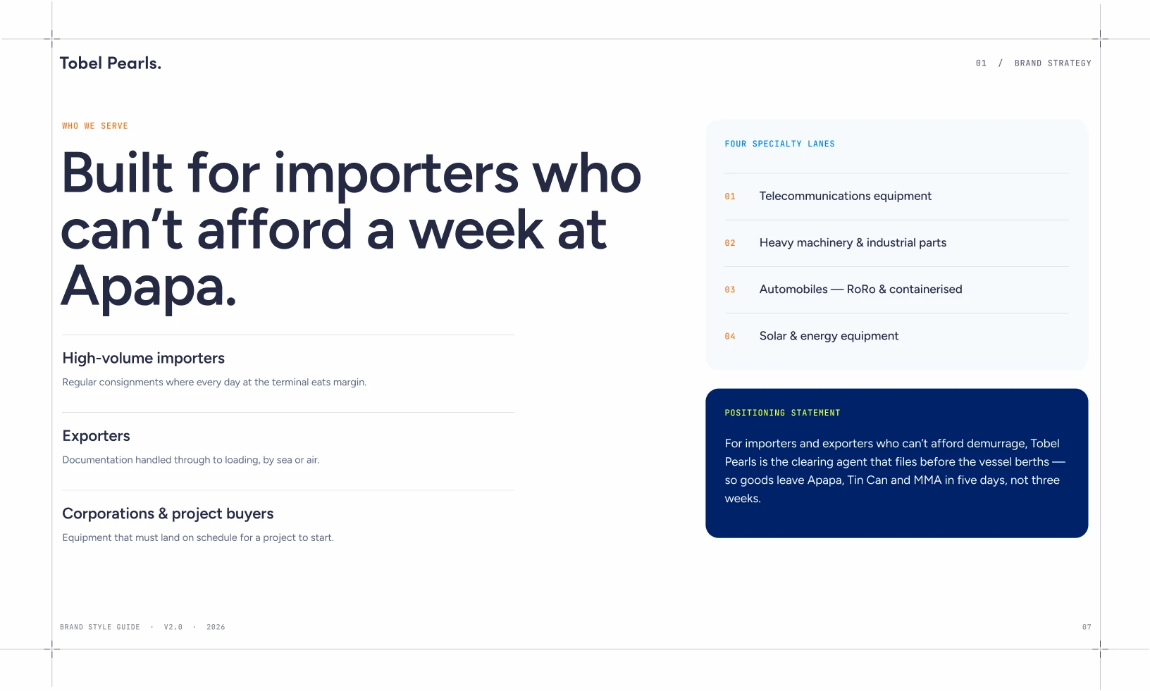
Client project. Tobel Pearls clears air and sea freight through Apapa, Tin Can Island and MMA in Lagos, with a hard promise: five days, maximum. We turned a strong mark and scattered materials into one brand system, from strategy to the side of a truck.
- Strategy, voice, identity and applications in one guide
- 55-page guideline
- Fleet, signage, stationery, packaging, digital and print
- 30+ touchpoints
- From strategy to print, every decision written down
- 12 chapters
Status
Delivered. The strategy, the identity system and the 55-page guideline with shared Figma styles are with the client.
Tobel PearlsClient project · 2026
What we did
- Brand strategy
- Tone of voice
- Identity system
- Brand guideline
- Fleet and signage
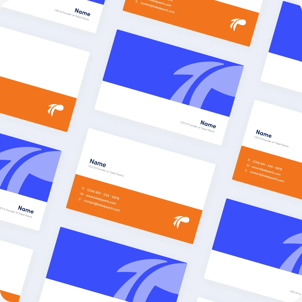
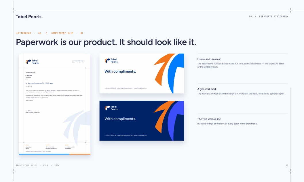
- Stationery
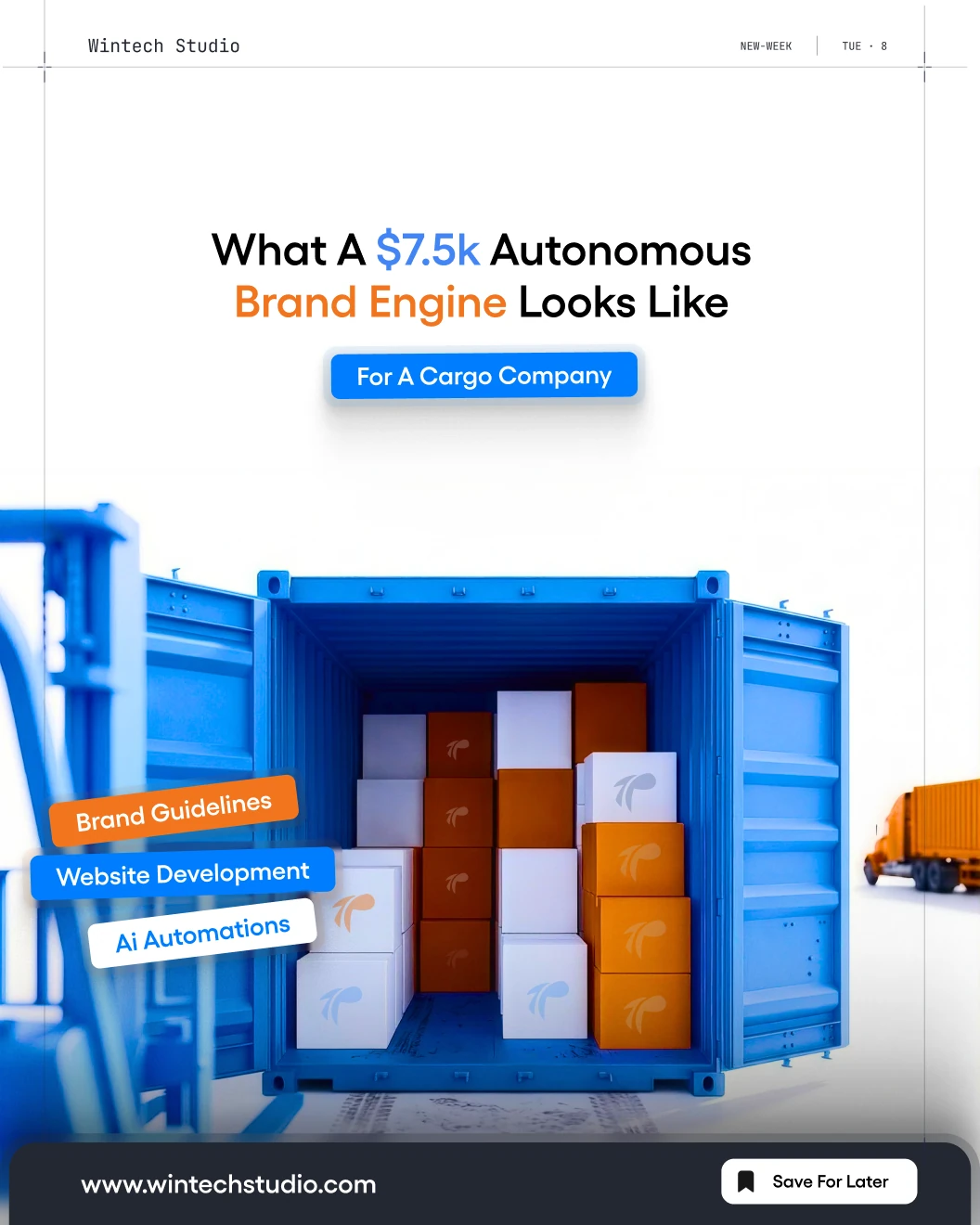
- Packaging
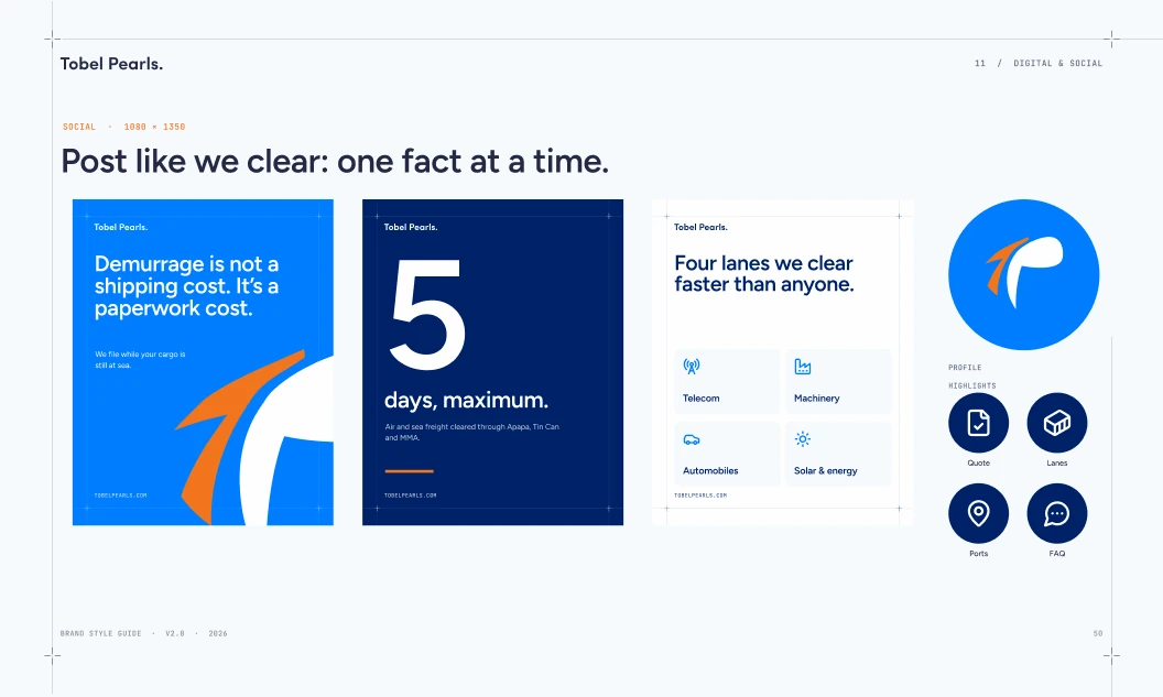
- Social
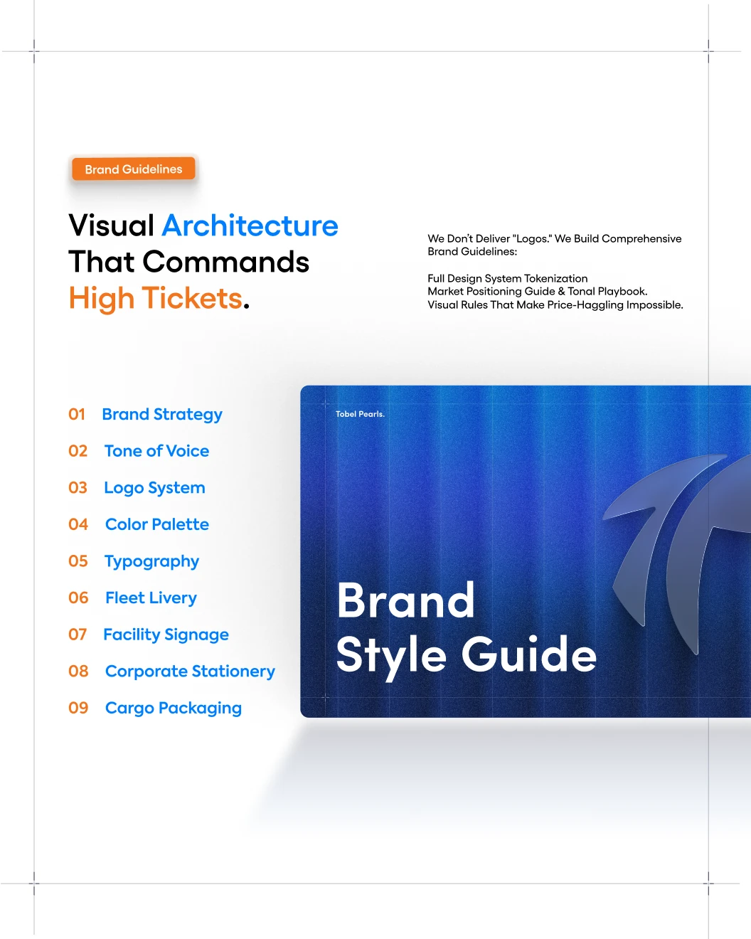
The guide
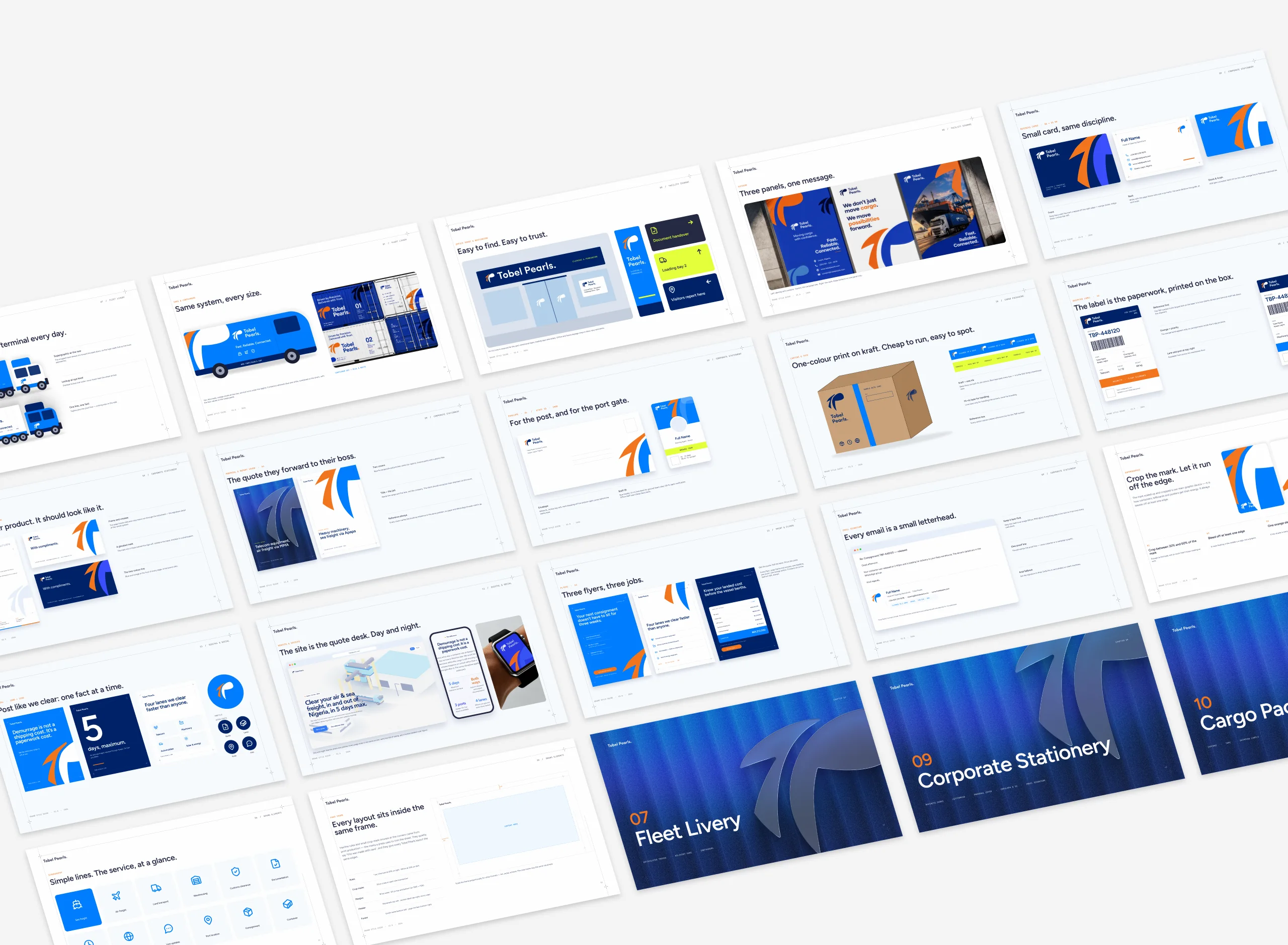
Fifty-five pages. As many on real life as on rules.
Twelve chapters, from strategy and voice to fleet, signage and print, handed over with shared text and colour styles in Figma.

What we inherited
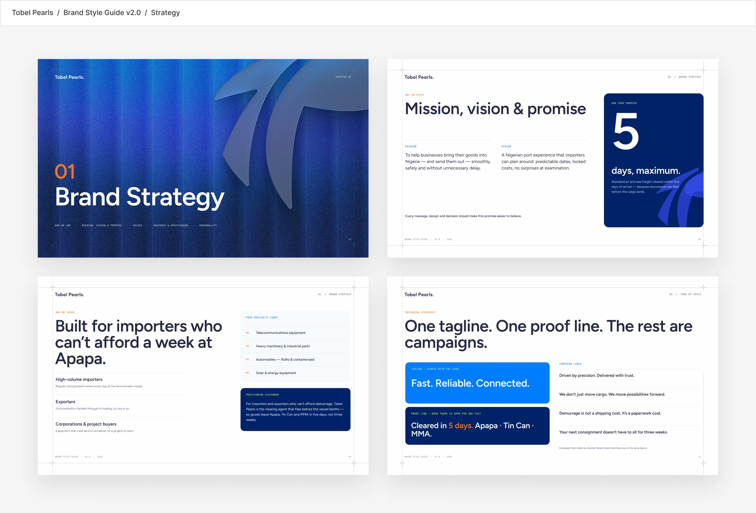
A strong mark, saying four different things.
Before designing anything, we audited every touchpoint: the logo files, the site prototype, the company profile, the stationery and the social posts. The mark was good. The system around it did not exist.
- Two spellings in circulation
- "Tobel Pearl" in the company profile, "Tobel Pearls" on the logo and the site.
- Nine colours, no roles
- Two competing blues, a lime with no job, and orange used everywhere.
- Four competing slogans
- Every piece of material described the company differently.
The insight
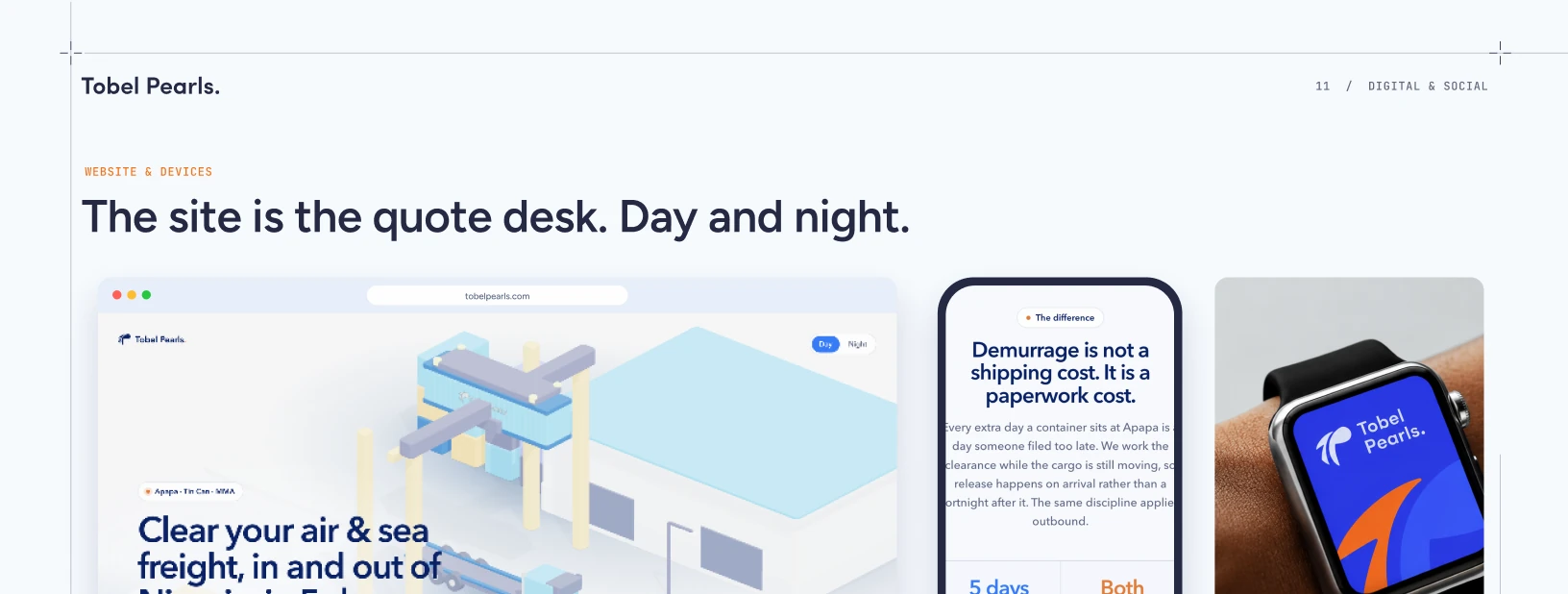
"Demurrage is not a shipping cost. It is a paperwork cost."
Every extra day at Apapa is a day someone filed too late. If Tobel Pearls wins on paperwork, the identity has to look like the most organised paperwork in the port. From there: one positioning line, one promise, five days.
The mark, read slowly
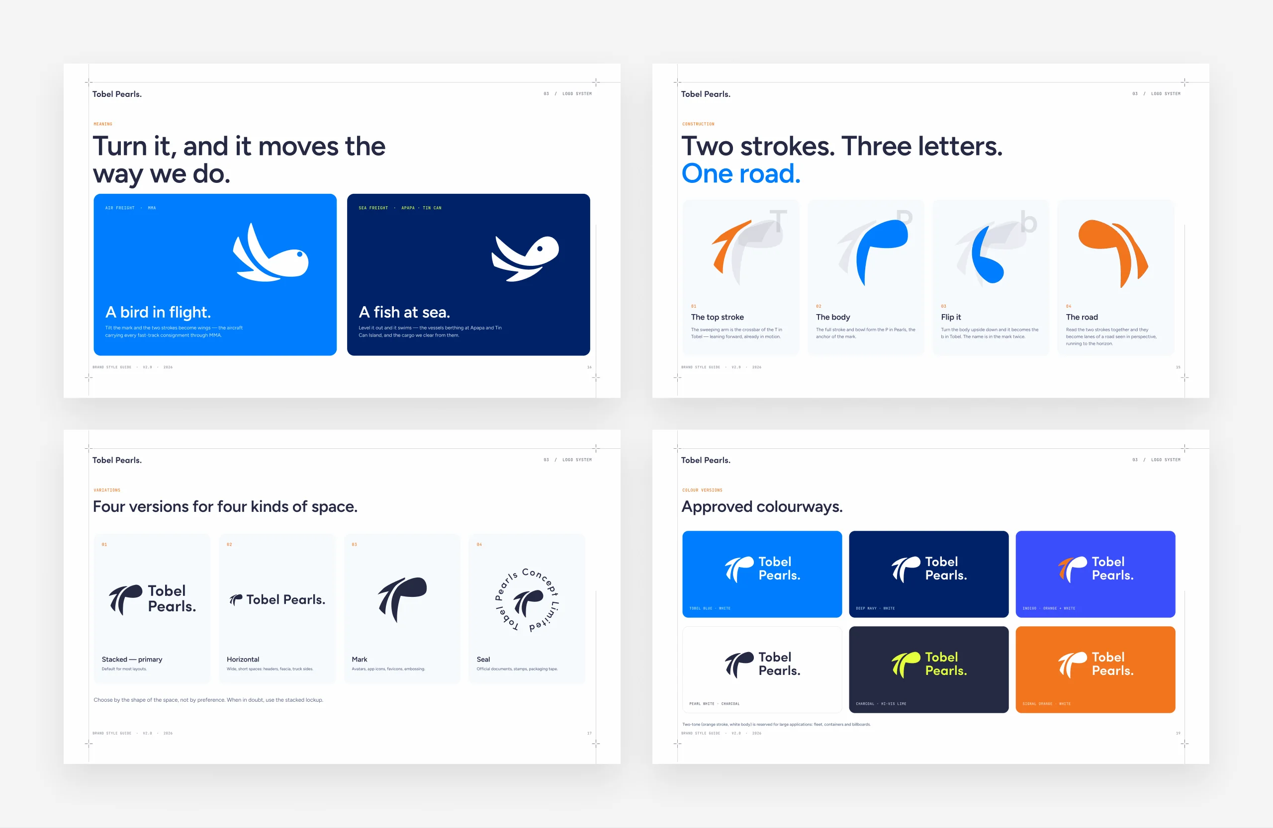
Two strokes. Three letters. One road. Two ways to travel.
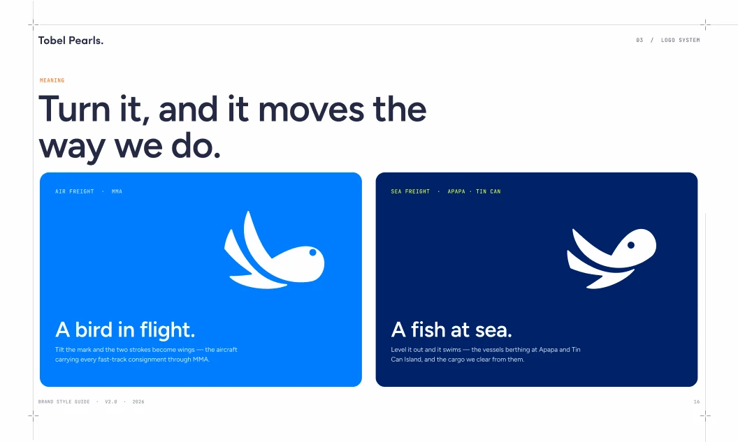
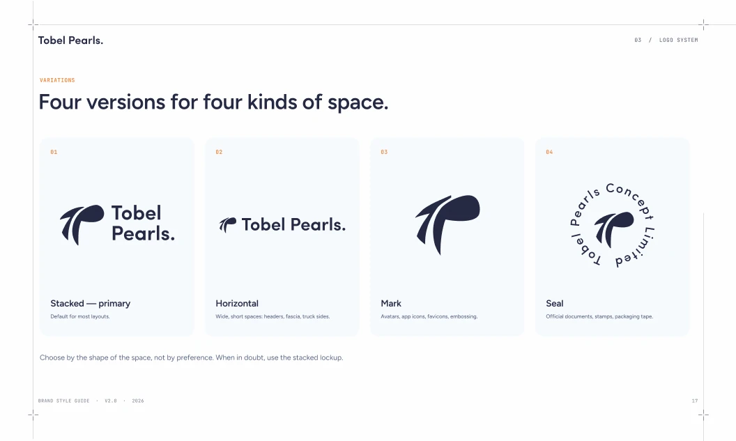
The top stroke is the crossbar of the T and the body is the P. Flip it and it becomes the b. Tilt it and the strokes become wings for air freight; level it out and it swims for sea.
Colour with a job, a voice with rules
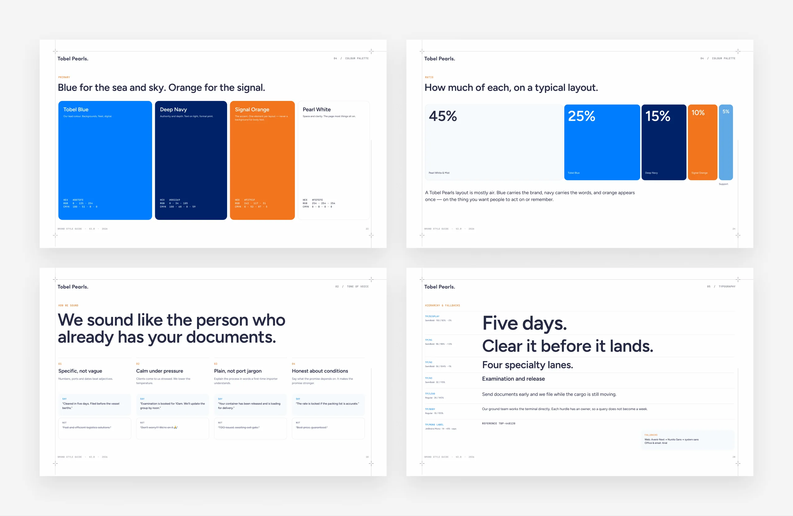
Nine colours became a hierarchy.
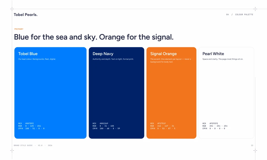
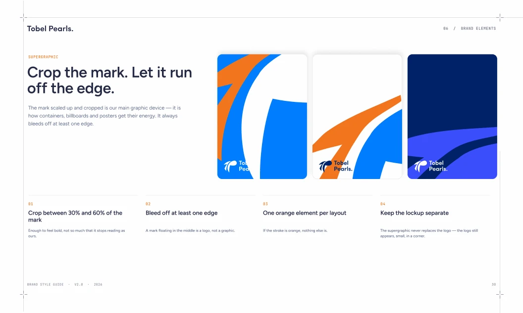
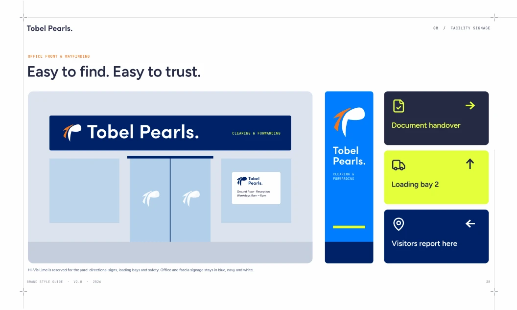
Tobel Blue leads, Deep Navy carries authority, Signal Orange appears once per layout and Hi-Vis Lime lives on the yard only. The voice sounds like the person who already has your documents: specific, calm and plain.
Paperwork is the product
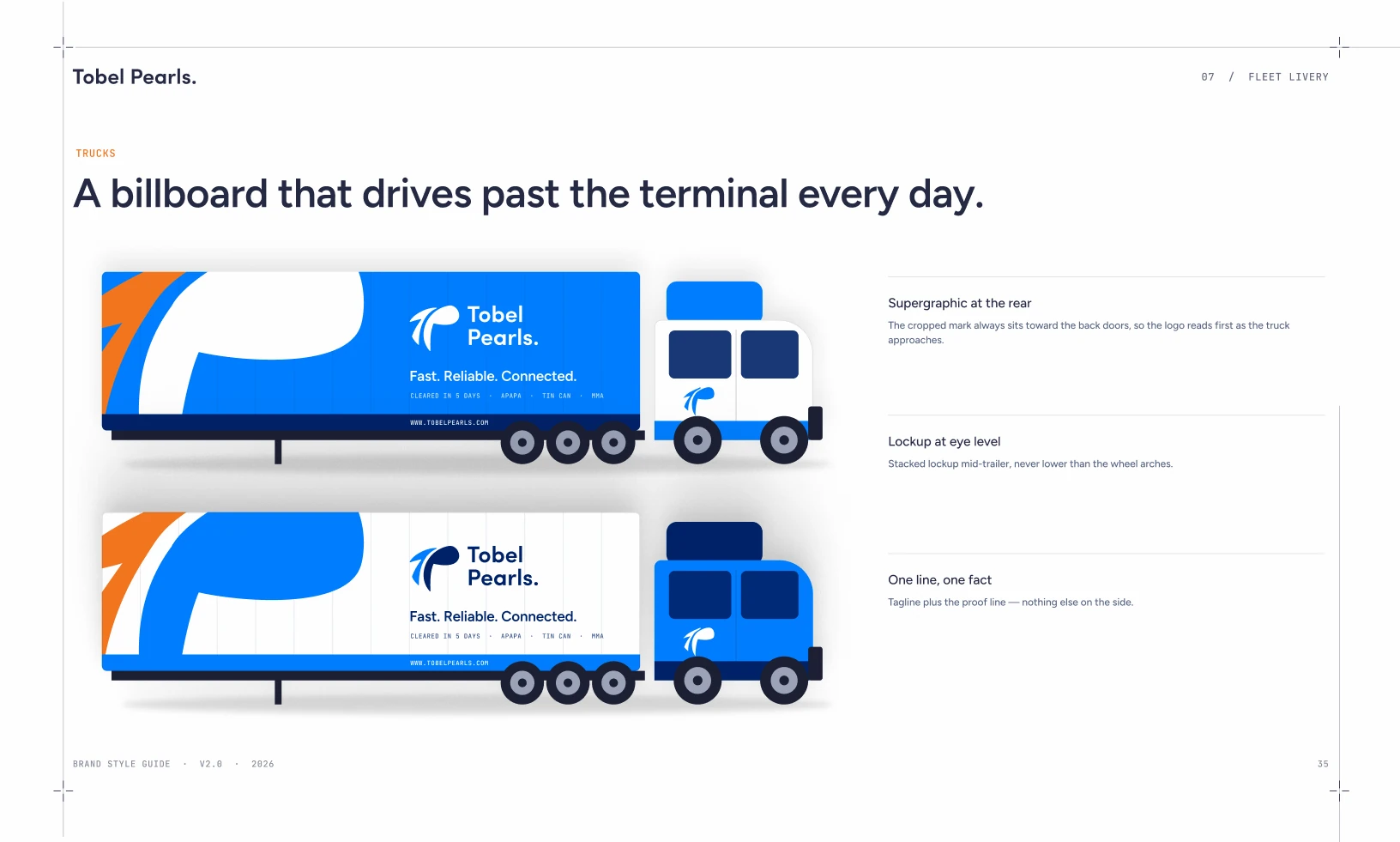
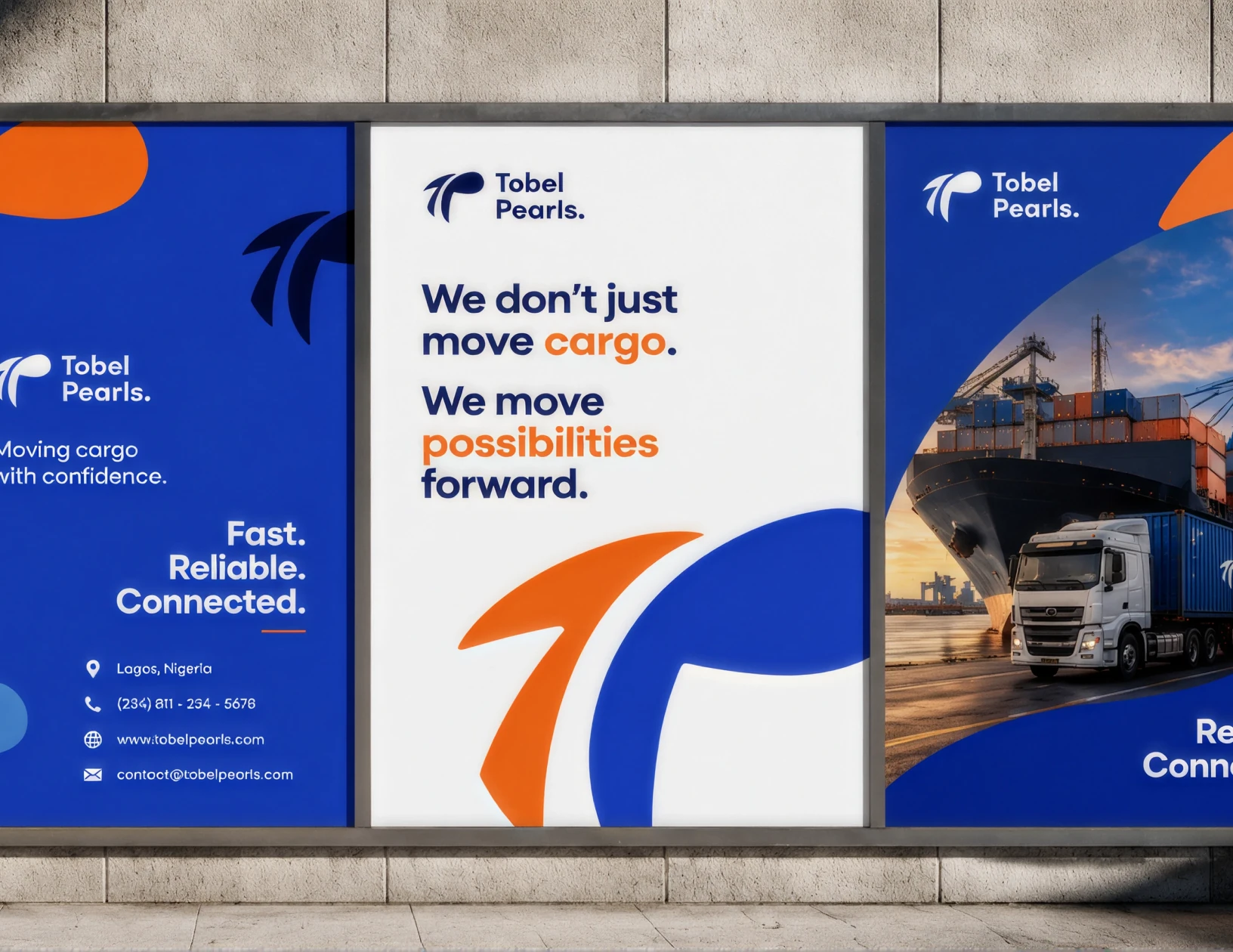
A billboard that drives past the terminal every day.
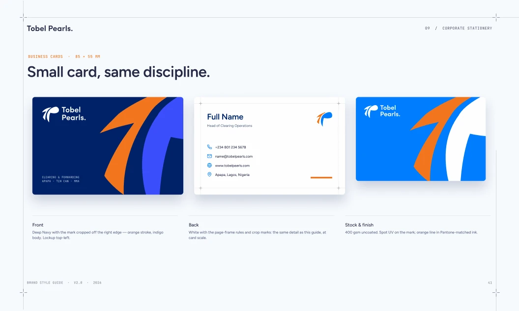
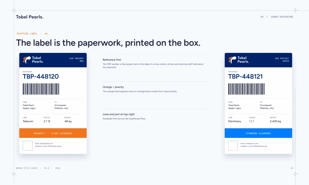
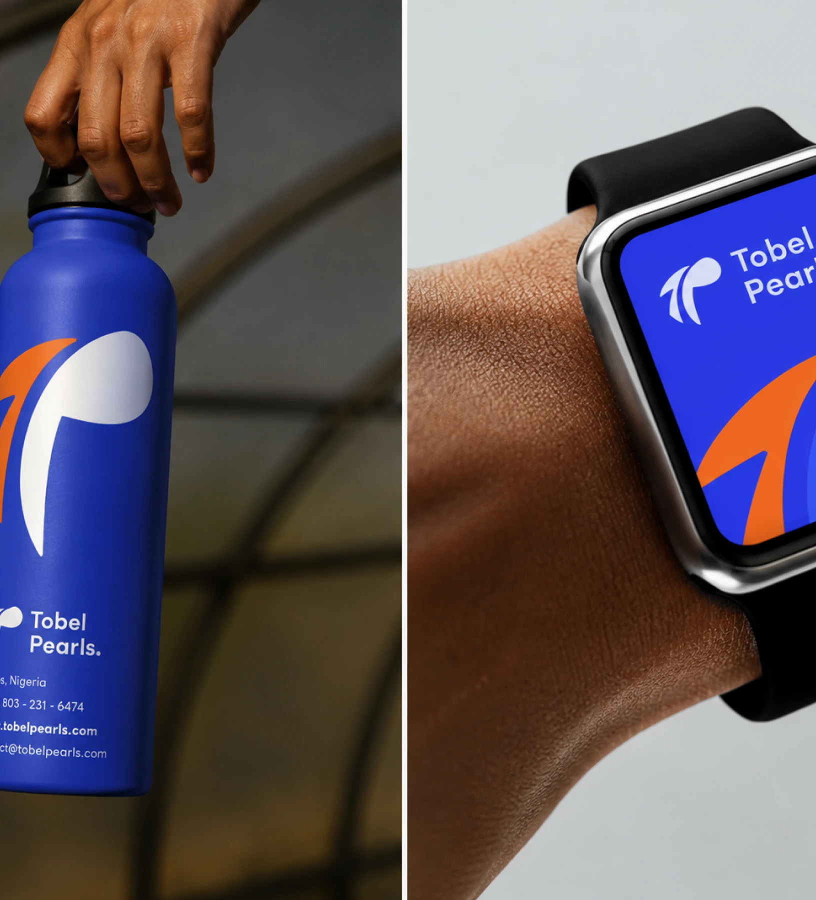
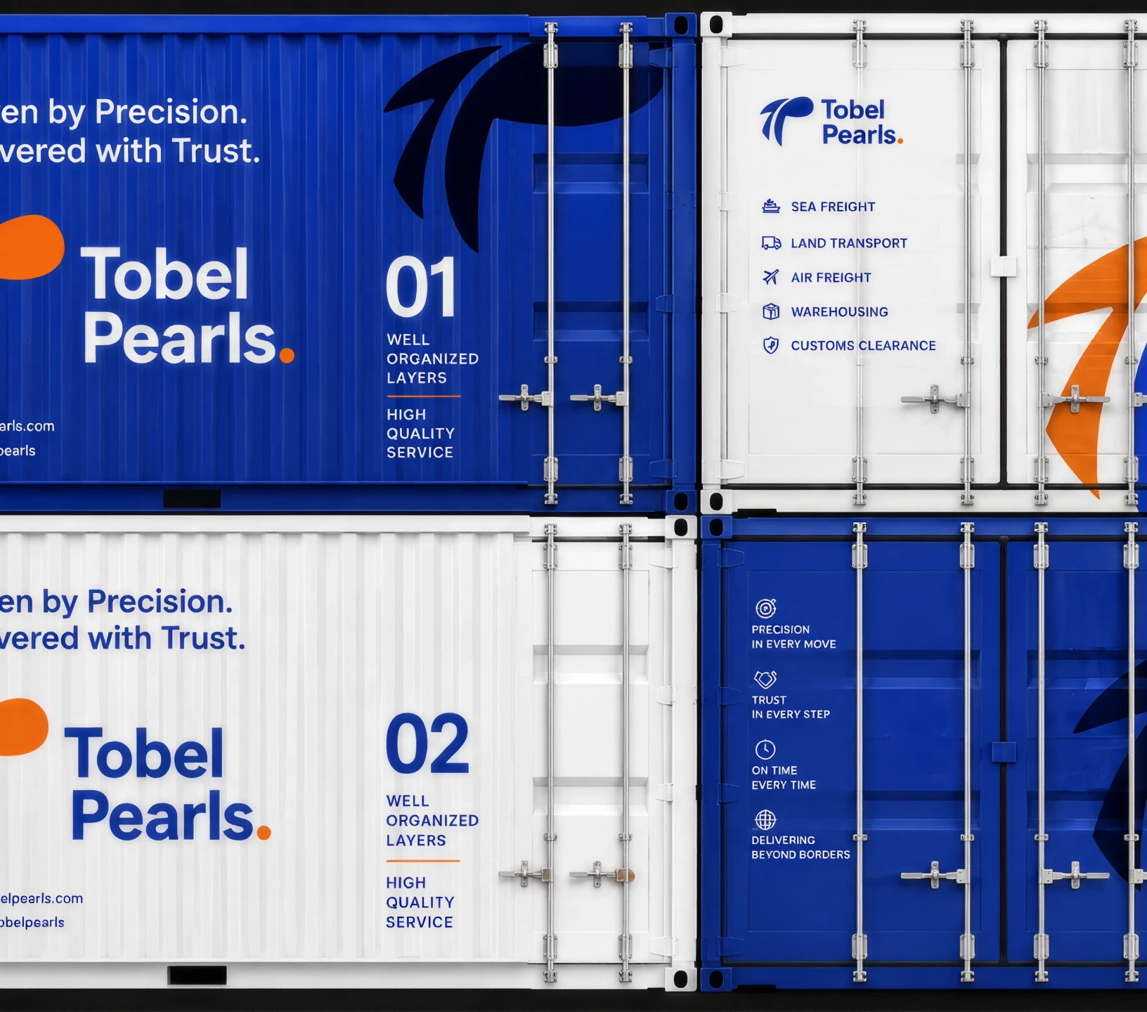
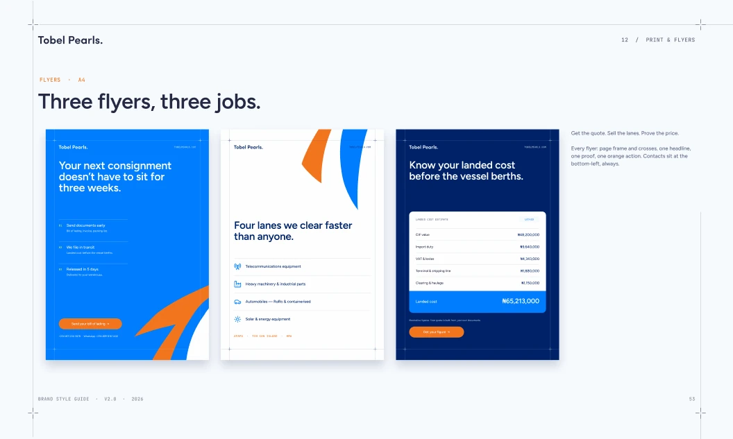
Fleet, signage, stationery, packaging and social, all tested at real size. The page-frame rules and crop marks from the guide run through every sheet, so every piece reads as part of one system.